A new set of key caps for my keyboard finally arrived yesterday, after nearly a month of waiting, so I thought I'd share some photos and also how I got them made.
For starters, the keyboard I own is the Keychron K2. From what I've seen, it may not be the most popular board, as it's relatively cheap, and a small form factor. But I find it to be very solid and one of the best keyboards I've used. However, the basic light/dark grey keys always seemed a little boring to me.
That's why when I saw much more hype around custom mechanical keyboards, I thought I'd finally look into seeing if I can customise mine at all. Turns out, the Keychron K2 uses Cherry MX style key caps, which are very common, so it looked like I'd be able to find a new set for myself.
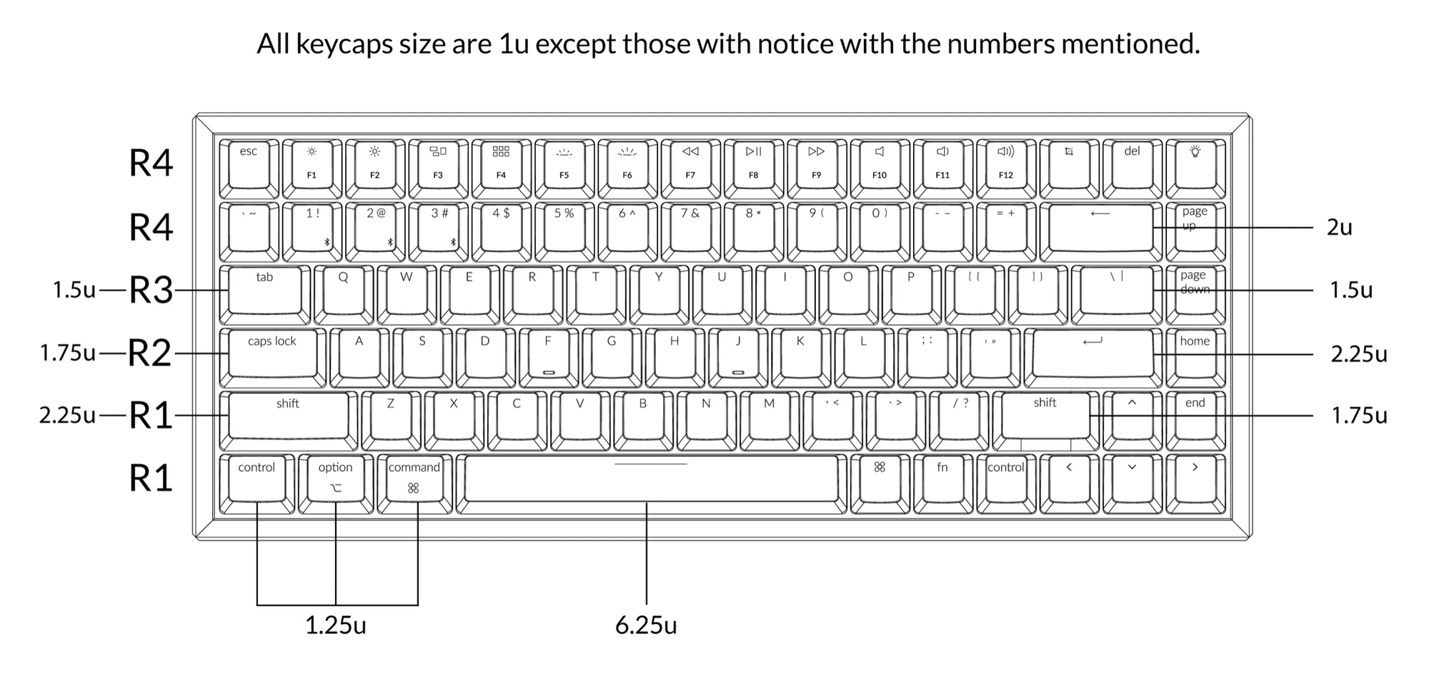
Although, when I saw the specification for the key sizes for the K2 (included on the page for the K2 key set page), I started thinking that the task would be much more hassle than I imagined. Since I was expecting that I'd need to go and purchase either a massive set of keys and hope the weird sizes of my keyboard are all included, or I'd need to find a way to buy seperate keys using the sizes from the spec sheet.
Luckily, I was doing some searching on the WASD Keyboards suport page, and found an article for "non-standard layout keycap sets". There have some information regarding colour availability for certain sizes, and information on how backlit keys show throw their keys. But I was more focussed on the fact they specifically mentioned the 84-key Keychron K2 layout, and had a link to their online customiser tool.
From there, I just needed to choose the colour of each key, legend, and also select that I wanted the Mac modifier keys. And after a while, I was pretty happy with my design.
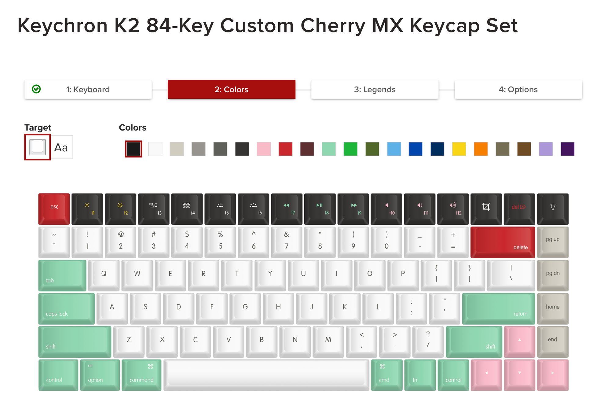
The main colour I liked was the mint for the modifier keys, but I wanted to mix a bit of pink in there somewhere. And also, I wanted to seperate the top row somehow, and the four keys on the right that I really never use.
So I ordered the keys, and after them being sent through the U.S., they eventually arrived, and this is what they look like:

Replacing the keys was pretty easy, there was a key remover tool included in the box. But it sure took a while to remove all the existing keys. That's not something I could ever enjoy.


As you can see from a few close ups, I also went a step further than just having different key colours. On the top row, I styled the text in a few colours to make them stand out just a bit more. The brightness keys have yellow symbols, the media keys are the same mint as the modifier keys, and the volume keys are pink. And I also had to match the delete key, so that's red on dark grey, with the big delete key being white on red, just like the escape key.
I'm very happy with how they turned out. Maybe the only thing I would change would be the symbol colour on the arrow keys, but then again I'm not sure what I'd change it to anyway.
I definitely think that just by customising the key caps, the keyboard feels way more personal than it did before. Before I had a Keychron K2 keyboard, but now this is my keyboard.
If you're thinking about changing your key caps, I'd definitely recommend looking into WASD keyboards. The online customiser tool is really easy to use, and the results are great too. And while I'm happy with my keyboard, if you don't have a mechanical keyboard, it may be worthwhile looking at what WASD offer themselves, since you'll be able to get it ordered from scratch with a complete custom key layout.
If you go ahead with ordering from Keychron, my link will get you 10% off your order.